
By Sarah J. · February 13, 2026
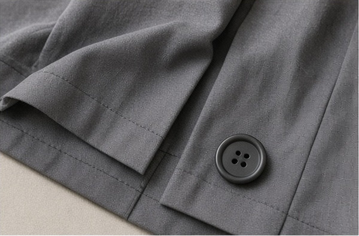
Compare repair thread colour in daylight against the actual cloth before committing. A phone screen or spool label cannot establish the finished effect; name the visual aim, check more than one ordinary light condition and keep function ahead of an exact cosmetic match when the repair requires it.
Key takeaways
- Choose blending or contrast.
- Compare actual materials.
- Keep function first.
Name the visual aim
Decide whether the repair should recede or be deliberately noticeable. Neither is automatically the better choice. Keep the garment owner's preference clear if you are helping someone else, and do not begin with a bright contrast simply because it photographs attractively in another person's example.
Keep the check tied to the actual garment and setting rather than turning one successful or awkward moment into a universal wardrobe rule.
Compare safely and simply
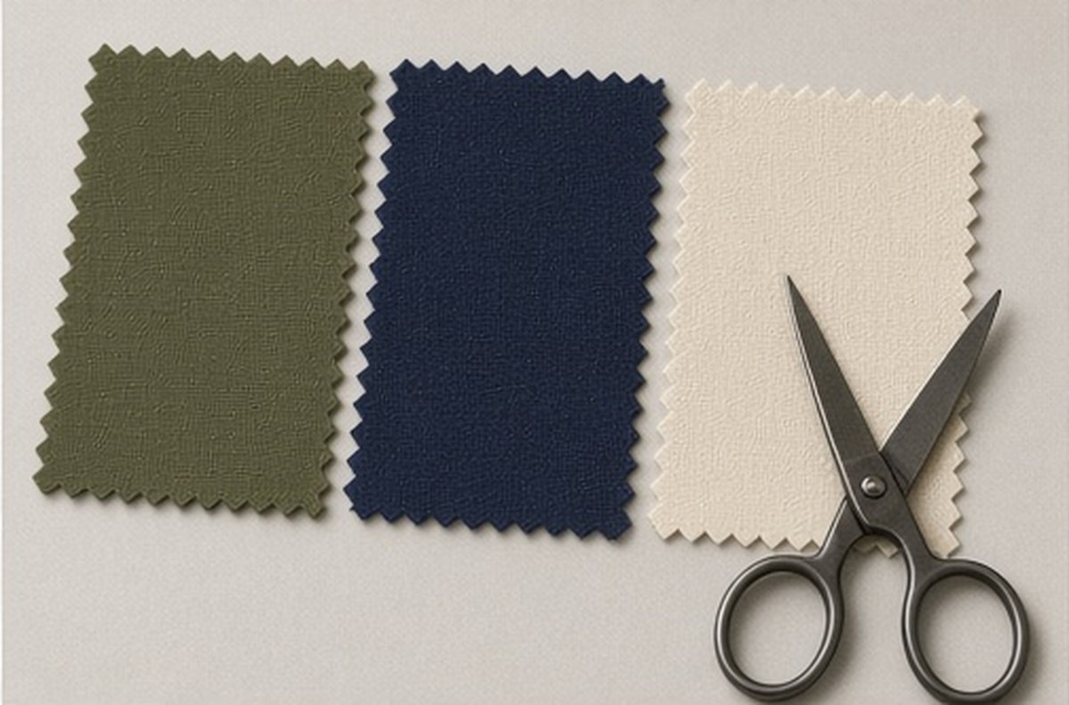
Lay a small sample of the thread near the repair area without snagging or marking the fabric. Look in daylight and the indoor light where the garment is often worn. A whole spool can appear different from the thin line that will actually form the stitches.
Keep the check tied to the actual garment and setting rather than turning one successful or awkward moment into a universal wardrobe rule.
Keep function in the decision
Colour is only one requirement. Thread type, garment construction and repair method must also be suitable, so ask for experienced advice where needed. If the correct functional choice is visually imperfect, discuss that trade-off before beginning rather than concealing it beneath a promise of invisibility.
Keep the check tied to the actual garment and setting rather than turning one successful or awkward moment into a universal wardrobe rule.
How should you compare repair thread colours before sewing?
Name the visual aim first: a quiet match, a close blend or a deliberate contrast. Then judge the actual thread against the actual cloth in more than one ordinary light condition. Daylight and the indoor light where the garment is often worn can reveal different relationships. A spool label or phone photograph cannot establish the finished effect on its own.
Keep the cloth and thread physically together for the comparison. Looking at them separately makes small differences harder to notice. Avoid committing a large amount of stitching until the relationship looks acceptable in the relevant light. A quick indoor glance under one lamp is a weak basis for a repair you will see every day.
A short specific note after the check is more useful later than a general impression that the arrangement seemed fine at the time.
Why does daylight deserve a place in the check?
Daylight can show undertones that a warm indoor bulb hides. That does not mean every repair must be chosen outdoors only, but it does mean at least one comparison should happen in ordinary natural light when possible. If daylight is unavailable, use more than one indoor condition and keep the limitation visible rather than declaring a perfect match from a single source.
Move the cloth gently so the thread is seen against both flatter and more textured areas where relevant. Knits, weaves and worn regions can take colour differently. The aim is a realistic preview of the repair location, not a laboratory colour exercise.
A short specific note after the check is more useful later than a general impression that the arrangement seemed fine at the time.
How do you keep the comparison safe and simple?
Use short lengths and secure methods appropriate to a test rather than stitching deep into the garment before you are ready. Keep original components and notes with the item. Do not cut into sound areas to create a colour sample. If you are unsure about the repair method itself, separate the colour question from the need for appropriate construction advice.
A phone screen can help record options, but recheck the physical materials before deciding. Screens shift colour. Treat digital images as reminders of candidates, not as the final judge against the cloth in your hands.
A short specific note after the check is more useful later than a general impression that the arrangement seemed fine at the time.
When should function lead over an exact cosmetic match?
When the repair’s strength, suitability or available thread options make an exact match secondary. A functional repair with a close or deliberate contrast can be better than delaying needed work for a perfect invisible colour that is not available. Keep that priority explicit so the finished look is chosen rather than accidental.
Discuss the aim with a repairer if someone else is doing the work. Quiet match and visible contrast are different briefs. Colour comparison still matters, but it should sit inside the functional scope rather than driving an unsuitable method.
What else belongs in the thread decision besides colour?
Fibre suitability, strength and the garment’s care implications can matter. A beautiful colour match that cannot take the required stress or care process is not a complete solution. Ask about appropriate materials for the actual cloth. Keep decorative embroidery threads distinct from threads intended for structural repair unless the guidance supports the use.
Retain leftover suitable thread with the garment identity when useful for later work. An anonymous spool in a mixed tin recreates the selection problem. A small labelled amount can make a future quiet repair easier without requiring a large stock of every colour.
How should you judge the result after stitching?
Look at the repair in the same kinds of light used for the comparison, including daylight when practical. Assess ordinary use gently rather than stressing the area to prove the colour choice. If the colour relationship is unacceptable but the function is sound, decide whether a further planned step is appropriate or whether the functional result is enough.
Keep the record modest: cloth, thread identity, visual aim and light conditions checked. Repair thread colour decisions improve when daylight and the actual materials lead, while function remains able to set the boundary of what the repair must achieve.
A good colour decision supports the repair rather than defining its whole success. Compare carefully, agree on the intended visibility and keep suitable construction ahead of a promise that no one will ever notice.
Which practical check fits the situation?
| Situation | Practical check |
|---|---|
| Aim | Choose quiet match, close blend or deliberate contrast. |
| Light | Compare thread and cloth in daylight and ordinary indoor light. |
| Priority | Keep function ahead of exact cosmetics when the repair requires it. |
Related reading
- A Replacement Button From Your Tin: Compare More Than Colour
- A Clothing Repair Queue That Fits One Available Evening
- A Spill and a Needed Repair: Agree the Care Sequence First
Frequently asked questions
No. Lighting, camera processing and display settings can alter colour; use the physical materials where possible.
No. Construction and repair method still matter, even when the colour appears very close.
No. Compare the actual thread against the actual fabric in relevant light.
Prefer more than one ordinary light condition, including daylight when possible.
Not necessarily. Keep function in the brief and choose the best available appropriate option.