
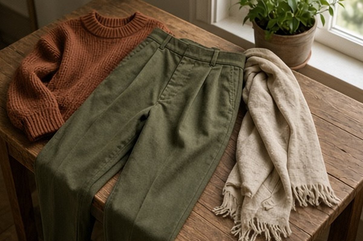
A capsule palette can become a reason to shop when its real purpose should be to make dressing easier. Two accent colours are enough for a useful experiment: choose colours already present in clothes you wear and see how they work with the rest of the wardrobe. There is no requirement that every accent must match every other piece.
This is a styling map, not a rule about flattering colours or a prescription for how many garments to own. Start with real days, comfortable pieces and necessary functions. The palette should describe usable outfits rather than create a visual standard that your existing wardrobe is expected to satisfy.
Choose accents from actual favourites
Look at the garments you repeatedly enjoy wearing. Select two colours from those pieces rather than two swatches that appeal only as an image. A favourite rust cardigan and a blue shirt can provide more useful starting points than a perfectly coordinated palette with no existing garments behind it.
Do not exclude a colour because it seems insufficiently seasonal or because an online guide calls another shade more versatile. Your preferences matter. The purpose is to understand relationships in your own wardrobe, not to replace personal taste with a general theory of what a capsule should look like.
Identify the quiet partners
Choose the trousers, skirts, shoes and layers you already use with those accents. Quiet does not have to mean a particular neutral. It can mean a familiar partner that makes the combination easy and comfortable without adding another decision.
Keep function visible. Appropriate shoes or outerwear should not be replaced by a less suitable option simply because the colour map looks tidier. A palette is one part of an outfit, and it cannot establish weather protection, dress-code suitability or fit. Let those requirements remain separate lines in the plan.
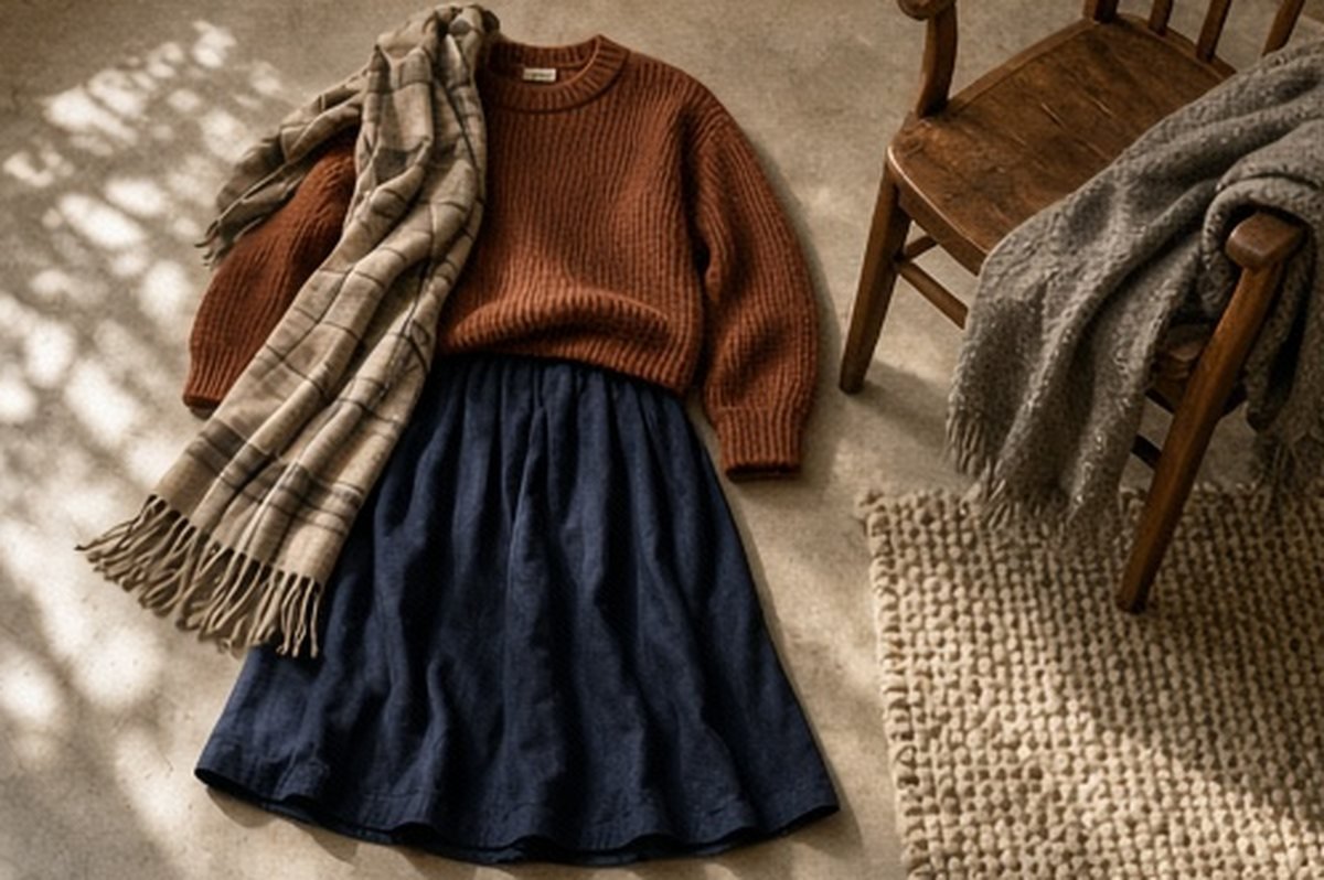
Make one outfit for each accent
Build a complete ordinary outfit around accent one and another around accent two. Include the underlayers and outerwear needed for the day. Check sitting, walking and any relevant transitions rather than stopping at a flat lay or a standing photograph.
If one outfit fails, describe why. A neckline conflict or unavailable laundry item is not a colour problem. Keeping the cause specific prevents the palette exercise from producing unnecessary replacements. You may need a different existing combination, a repair or another care arrangement rather than a new shade.
Test shared partners without demanding universality
See whether one or two existing pieces work with both accents. This can simplify dressing, but it is not compulsory for every item. A cardigan that works beautifully with one shirt can still be useful even if the other combination is not your preference.
Avoid counting theoretical matches as ready outfits. Two colours may look attractive together while the garments' shapes do not cooperate. Fit, length and movement still need assessment. The map should show combinations you would choose in ordinary life, not every pairing that can be justified through a colour wheel.
Decide whether the accents need to meet
You may enjoy wearing both accent colours together, or prefer each in a separate outfit. Either approach can work. Do not buy a patterned bridge piece merely because a capsule formula says the colours need connecting.
If you try the combined outfit, use existing garments and judge the whole arrangement. A small repeated colour may provide a visual link, but exact matching is not required. Screens and photographs can alter appearance, so use the actual pieces in ordinary light where possible rather than treating a digital collage as conclusive.
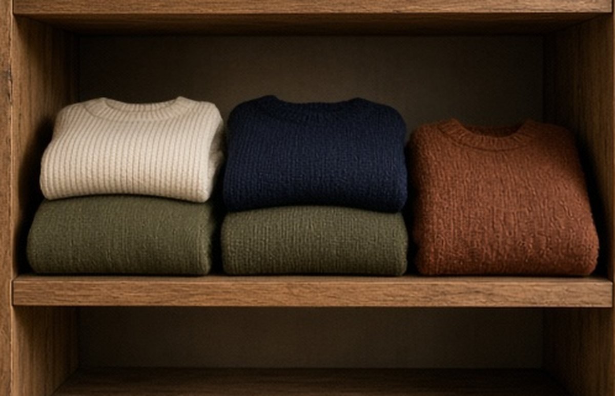
Include repetition and care
Map a few real days and allow repetition. The aim is not to produce a new look for every occasion. Check which garments are genuinely ready after wear and which will be unavailable during appropriate care. A useful palette does not remove ordinary laundry or condition decisions.
If one accent depends on a single top that is frequently awaiting care, note that limitation. Do not automatically buy another in the same colour. Check whether a different existing piece or a revised outfit plan answers the need. The colour should support the routine rather than dictate purchases to maintain an ideal visual balance.
Keep unrelated favourites outside the experiment
A small palette exercise does not require removing every garment that falls outside it. Keep useful favourites even if they do not fit the two-accent map. The experiment is a way to see a subset clearly, not a judgment on the value of the whole wardrobe.
This distinction matters for occasion clothes, seasonal pieces and personal favourites with narrower roles. They do not need to earn permission through constant coordination. A thoughtful wardrobe can contain a simple everyday system and a few items that are enjoyed for different reasons, without forcing them all into one colour story.
A small written map can separate a true missing outfit from simple repetition. Wearing the same successful combination again is not a gap. Only consider another item when there is a specific unmet use, not because the two accents fail to appear equally often in the notes.
Let the map guide a specific gap
Save the combinations that worked and identify any genuine missing function. Describe that gap through use and fit before assigning a colour. A replacement layer should first meet the actual task; a preferred accent can then refine the choice if several suitable options exist.
Two accent colours are useful when they reduce decisions, not when they make shopping more urgent. The strongest outcome is a handful of comfortable outfits you can repeat and a clearer understanding of the clothes already working for you. A palette can remain small, flexible and incomplete without failing its purpose.